
Poe
Building design engineering practice and earning trust
The gap between design and engineering is usually framed as a communication problem. Hand-offs, specs, feedback loops. Fix those and the gap closes.
At Poe, the problem ran deeper. The root cause was a skill gap, and skill gaps create problems that communication fixes can't reach.
Quora's designers were product-focused. They could design and some could build. But designing a product feature and building a design system that scales are entirely different disciplines. One requires product thinking. The other requires systems thinking: how components will be extended, how tokens will cascade, how decisions made today compound across the entire product over time. That expertise didn't exist on the team. Every feature built without it made the next one harder to get right.
On a shaky foundation
Making the case for design system investment before the problem is fully visible is hard. You don't know what you don't know at zero-to-one. Hiring a full-time design engineer before the product had proven itself was a hard sell. The path of least resistance was a contractor. Someone with design systems expertise and a frontend development background who could get the foundation in place without a long-term headcount commitment.
We started where it made sense to start. Semantic tokens for spacing, color, and typography, flowing consistently from Figma into code. Straightforward work. The kind of thing that feels small but matters enormously later. That part went well.
Building out components and driving adoption was a different story. Without a single dedicated owner, implementation drifted quickly. Design would ship a spec. Engineers would build something close, but not quite. Polish got cut because it was too hard to get right, or too time-consuming for engineers whose strengths were elsewhere. Frontend work that takes an experienced design engineer an hour could take a backend-leaning engineer half a day. And it's not interesting work for them. It shows.
The component layer didn't.
Adoption was inconsistent. The gap between what was designed and what shipped kept growing. Partially successful. But in the grand scheme of what we needed, a failure.
Building the discipline
The contractor engagement clarified what we actually needed. Not someone who could set up tokens and move on. A dedicated owner. Someone who lived at the intersection of design and engineering, with enough taste to know what good looked like and enough technical depth to build it themselves.
That person is rare. We found one.
He came in and did two things in parallel. The first was visible: refining the token system the contractor had established. Not starting over. Going deeper. The original tokens were semantically sound but lacked purpose at a product level. He added the layer of intentionality that a maturing product requires, distinguishing surface colors from foreground colors, defining tokens that reflected how the product was actually used rather than just what it needed to render.
The second was diagnostic. Understanding why component adoption kept drifting even when the specs were clear. The answer was in the code. Too much flexbox. Too much custom layout CSS written feature by feature, page by page, with each team solving the same layout problem slightly differently. In some cases, the components not supporting the actual use-cases as the product evolved. The design system had a fragmented structure, much like cracks in the foundation.
Part of the fix was Tailwind CSS, a layout framework that would do for structure what tokens had done for color and spacing. A consistent, composable system integrated with our own design system. With that foundation in place, the component work could actually hold.
He rebuilt the core component library, starting with ones that were most used and had the biggest gap in adoption. Buttons, dialogs, cards, inputs, each with the full range of variations, built to spec and built to last. Over twenty core UI components. For one person, this was a significant undertaking that played out over roughly twelve months of steady progress.
Buttons and icons became the most used component, reached meaningful adoption. A couple of components isn't a solved design system. The progress was real, but the scope of what remained was also real. While the foundation was solidifying in the background, the product in the foreground simply didn't reflect it.
Turning point
The design system work was moving in the right direction. But the product itself was at a standstill.
As the codebase grew more complex, velocity had slowed to an excruciating pace. No major features shipped for six to nine months. Engineering was under pressure from a company-wide velocity initiative. The code was accumulating debt faster than anyone could pay it down. Bloated CSS, inconsistent components, maintenance overhead that compounded with every new feature.
Designers were feeling it differently. Our engagement survey made it explicit: they wanted more ownership over craft and quality. They could see what the product should look like. They didn't have the agency to close the gap themselves.
One underlying problem.
Engineering had a week-long hackathon on the horizon. A focused, company-wide push on developer velocity. Already planned and scoped. As a leader, that's the moment to connect the dots. To see an existing initiative and recognize it as the vehicle for a non-obvious move.
The pitch to engineering wasn't about design wanting more control. It was about adding capacity to a problem they were already trying to solve. Designers helping to migrate components and clean up CSS meant engineers could focus on the work only they could do. More hands on a shared problem. The ask: let us be part of this.
Getting a yes meant working through engineering leadership and the security team. More people with codebase access meant higher risk. That had to be addressed directly, setting the right level of permission to access our systems. We also defined what was in scope for designers to touch, established guardrails, and got explicit sign-off before anyone opened an IDE.
In parallel, our design engineer was building something that would make the hackathon actually work. By this point, twelve months of foundational work had produced a design system mature enough for AI to genuinely leverage. He built a Claude skill that fully leverages our components, icons, and design tokens. Alongside that, a design.md that covers design thinking principles, component discovery and usage guidelines, all encoded in a format the model could read and apply consistently. Critically, the documentation powering all of it was generated automatically as components were updated. The design system and its AI context stayed in sync without manual effort. A single source of truth, machine-created and machine-readable.
The goal was that a designer could describe what they needed in plain language, and get back code that already matched our design system. Not a best guess. Not something that needed to be corrected after the fact. The right component, the right tokens, the right patterns from the start.
Training turned out to be the hardest part. Over half of our designers weren't technical. Everything from basic terminal commands, to how git works, to navigating the engineering development process without breaking things was a hurdle. Technical designers and our design engineer ran the sessions. The bar wasn't "become an engineer." It was "know enough to contribute confidently and safely."
The hackathon delivered. Every designer contributed. Components were migrated. CSS bloat was reduced. Real improvements shipped to the product.
The results landed loudly enough that the work was recognized at the company all-hands by the CEO. It wasn't just design and engineering paying attention. Mobile engineering leaders saw what was happening and started asking questions.
Making it stick
The CEO's response made clear this wasn't going to be a one-time event. Designers coding and contributing directly to the product wasn't just about quality, it was also about velocity. That combination was compelling enough to invest in properly.
We formalized it as a Design Quality Initiative. Rather than overcommitting on scope, we ran it as a quarter-long pilot. Enough time to fine-tune the operations before locking anything in permanently.
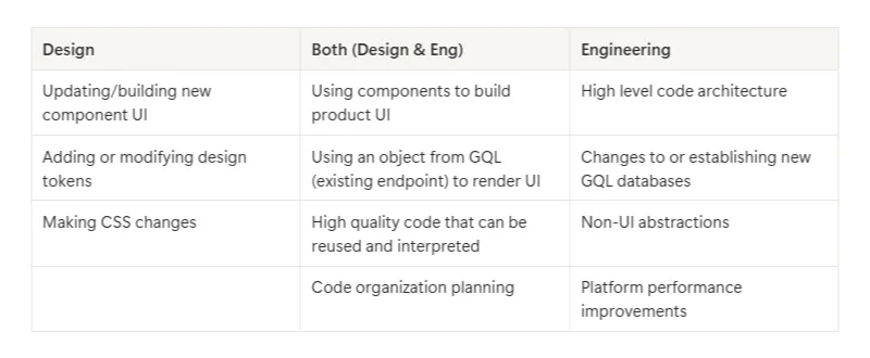
The operational questions we had to answer: Where does the work come from, and how do we prioritize it? How much time are designers expected to contribute, and what's the difference between work that gets a light review versus a full one? How do we make sure designers feel supported rather than overwhelmed, and that this reads as real ownership, not extra responsibility stacked on top of an already full role?
We structured it around three rhythms. A monthly check-in to review progress, surface larger blockers, and scope new projects entering the initiative. A biweekly check-in to track individual tasks and identify where design engineering support was needed. A weekly education session run by our design engineer, covering new developments, tips and tricks, and design system work that improved quality of life for the team.
The cadence wasn't bureaucratic overhead. It was what made the initiative sustainable. Designers knew when they'd get help, how their work would be reviewed, and where to go when something was harder than expected. Before the end of the quarter, our check-ins showed significant progress, a testament to the team's dedication to the initiative.
- +911 lines added
- -1,329 lines removed
- Component usages: 1,204 to 2,261 (+1,057, 87.8%)
- Pages with component imports: 525 to 843 (+318, +60.6%)
- Legacy component usages: 175 to 63 (-112, -64.0%)
- Files using non-standard components: 118 to 57 (-51.7%)
- Legacy buttons: 113 to 14 (-87.6%)
- Legacy modals: 62 to 49 (-21.0%)