Poe
What is Poe?
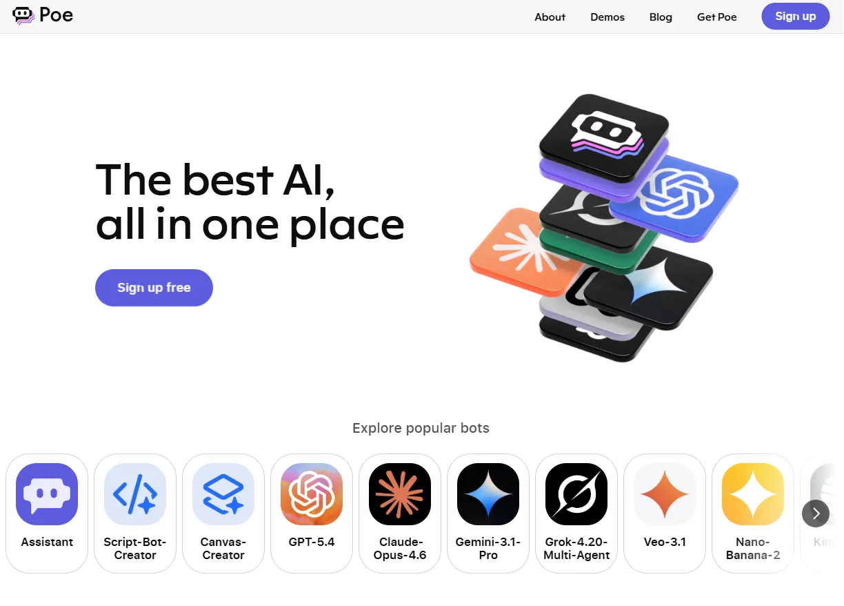
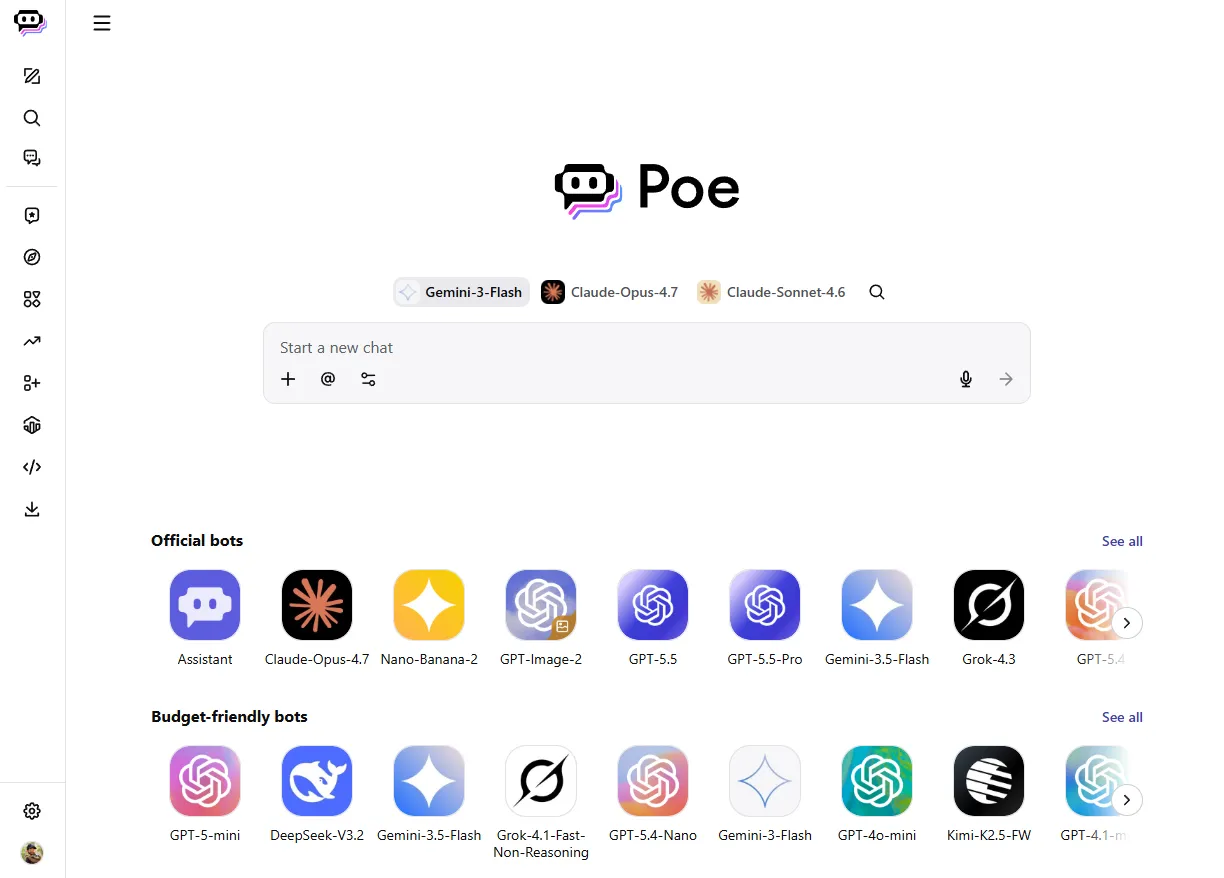
Poe gives people access to the best AI models, across modalities, all in one place. Claude, GPT-4, Gemini, Grok, and many others, through a unified platform built for consumers, creators, and developers. A single subscription for every AI need, through a chat interface or the API.
It launched within Quora. Small team. Establishing a new playbook in a space changing faster than any roadmap could anticipate.
Leading design here meant two things at once. Building how the team worked, and helping solve the product's hardest problems.
Moving at the speed of the product
Quora operates on a quarterly planning cadence. For a product with a relatively stable roadmap, that works. Poe was different. Priorities that made sense on Monday could be obsolete by Friday. The feedback from product was clear: design wasn't iterating fast enough to keep up.
The problem was the operating model, not the effort. It had been designed for a different environment.
We moved design reviews to a daily cadence, as needed, with the CEO and head of product in the room. Decisions that previously took days to reach the right people now happened same-day to unblock the team. Slack check-ins each morning kept overhead low. If there was nothing to review, we cancelled.
We invested in real-time user sentiment tooling. Quarterly surveys are useful but always looking backward. Combining in-product surveys, lapsed user research, and feedback from highly engaged power users gave us a clearer picture: what features were causing users to leave, and what would make the product worth paying for.
We created a dedicated table stakes workstream to act on those signals consistently. Led by the design manager already closest to the core product work, paired with the lead PM. Resourced based on what the team could absorb each cycle. It became one of the most productive and consistently shipping workstreams on the team.
Freeing the team to do the work that matters
Keeping a product's brand and story current requires constant upkeep. New models launching on a daily basis, landing pages updating, blog posts giving social traffic somewhere to land, legal copy staying current, translations managed across markets. None of it is product work. But all of it was sitting in the engineering queue, competing with product work.
Every ticket was a tradeoff.
Engineering was the bottleneck on work that others could do themselves.
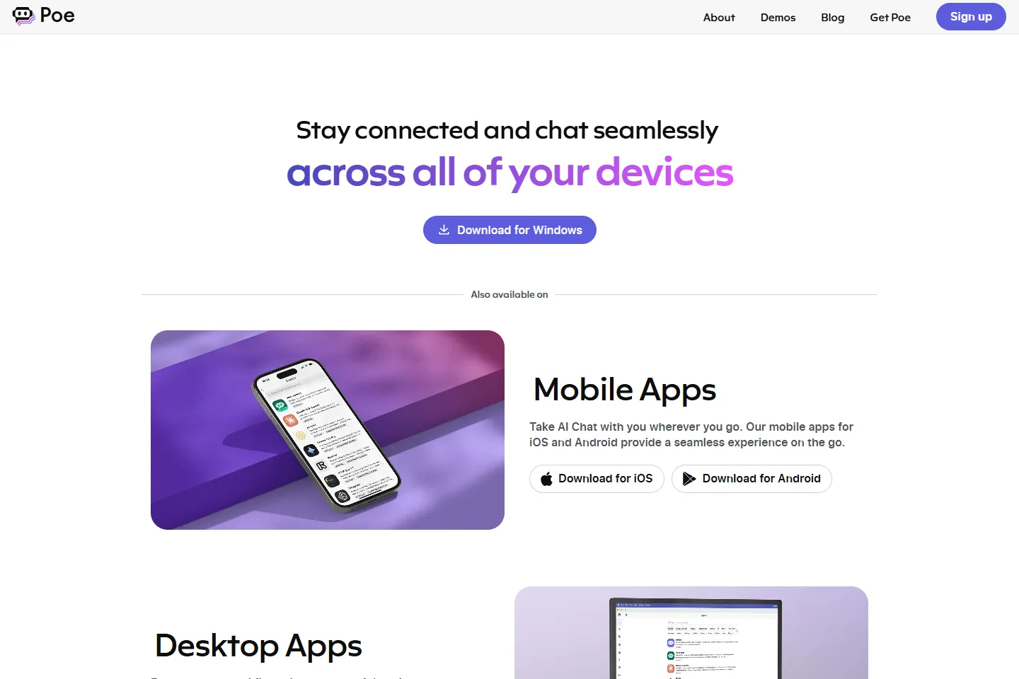
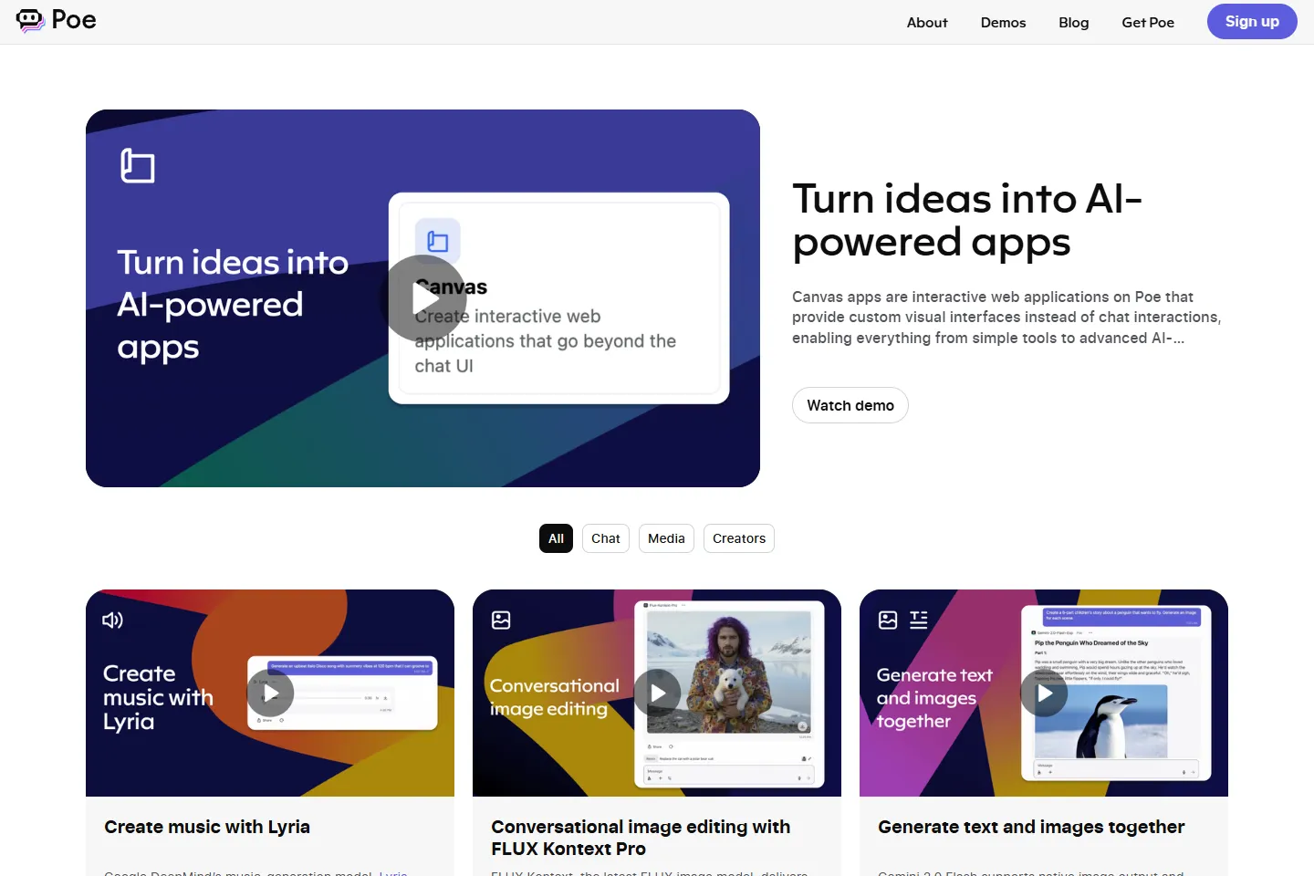
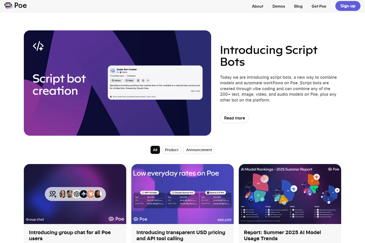
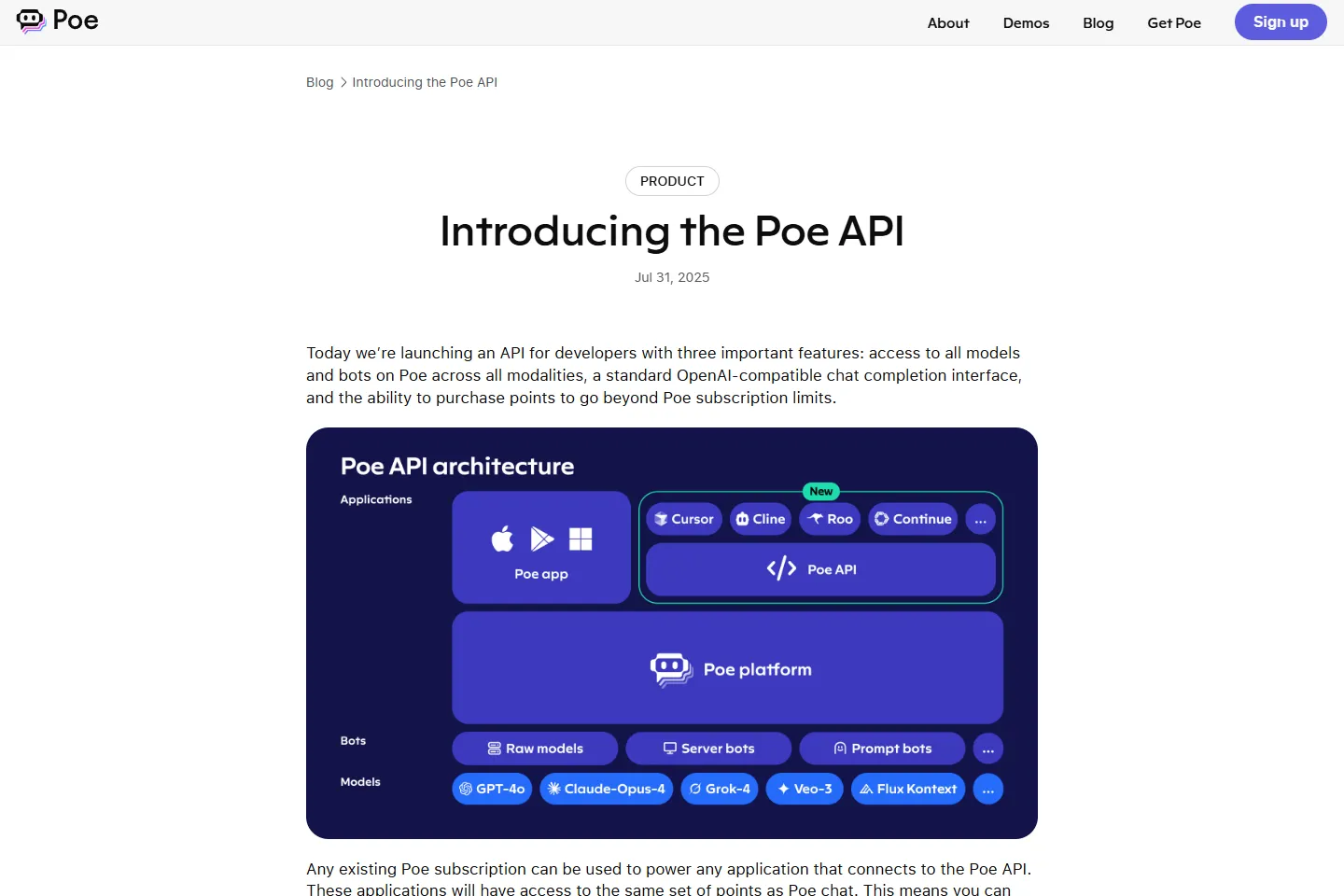
A no-code solution meant designers could build and update the marketing site without filing a ticket. Marketers could tell the product story in real time. Legal and ops could do their jobs without waiting in line. Engineering's roadmap stayed focused on the product.
Automated AI translations cut ops work, templated social assets freed up design time, and landing page experiments no longer needed data science.
Getting there required making the business case to the CEO and CFO directly, framed around organizational efficiency rather than design preferences. Each function needed to understand the process change and feel ownership over it. A clear matrix of ownership and a roadmap for rollout made it a straightforward decision once the full picture was visible.
Closing the gap between design and engineering
Quora's engineering culture is full-stack with a backend lean. But frontend work, the layer closest to what users actually see and touch, didn't have a natural owner with deep expertise. Components got built and rebuilt independently. CSS accumulated. A small visual change to something like a modal dialog could take days because there were dozens of separate implementations of the same element.
An early investment in a design engineering consultant got the basics in place: a stable token system for spacing and color. But without dedicated, sustained effort, components stayed inconsistent. The gap between what was designed and what shipped grew.
It took a series of steps (and missteps) to solve the problem properly. Bringing on a full-time design engineer to standardize the component library. The technical work was only part of it. Getting teams to adopt new components over familiar patterns required active evangelism, education, and a real migration effort.
Then a hackathon week became the turning point. The design team had been vocal about wanting more ownership over craft and quality. AI tooling had advanced to the point where designers working directly in the codebase was viable. We set the team up with access to Claude and the codebase, which required earning engineering trust and passing security review. We spent the week migrating components and shipping real improvements to the product. The results made the case for what came next.
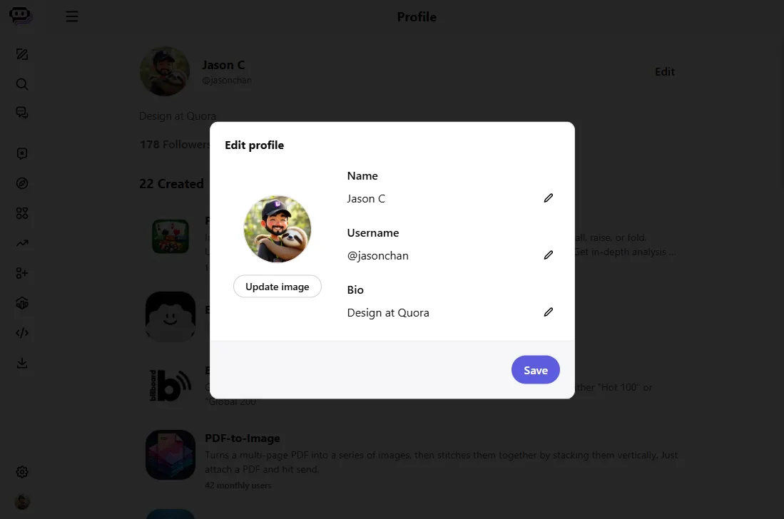
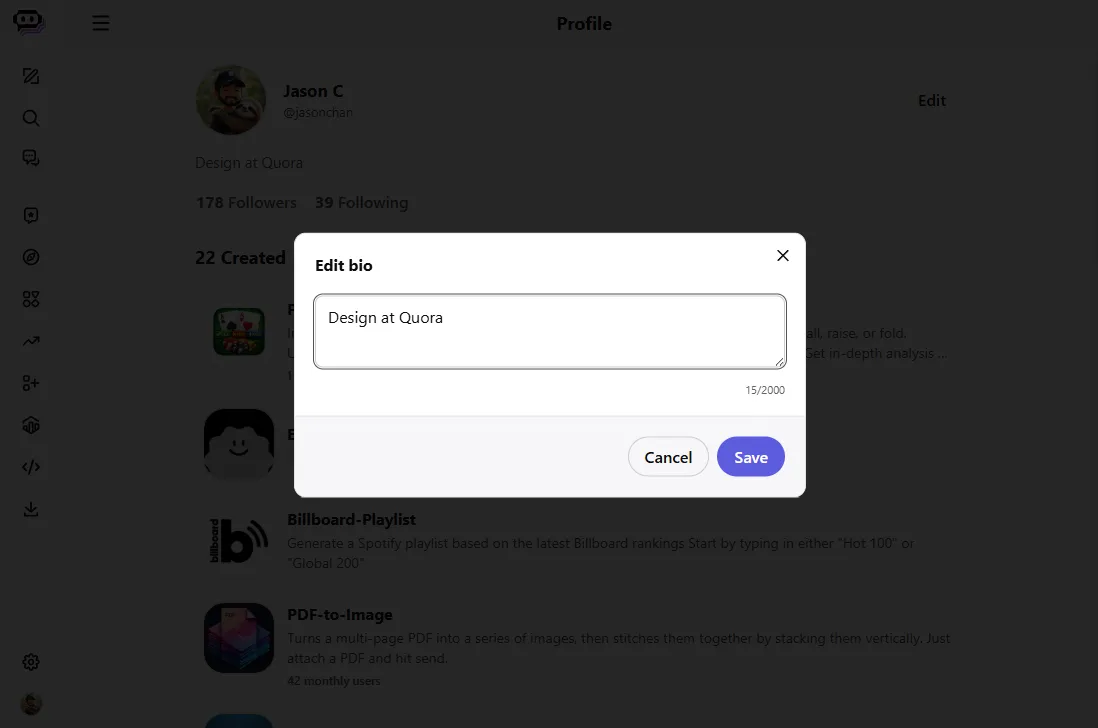
We formalized it under a Design Quality Initiative. It let designers prototype, produce production-level code, fix UI bugs, and contribute to migration directly. Newer models let us make the design system a single source of truth, machine created, machine updated, and machine readable. Anyone building a new feature with AI could achieve a consistent, quality UI.
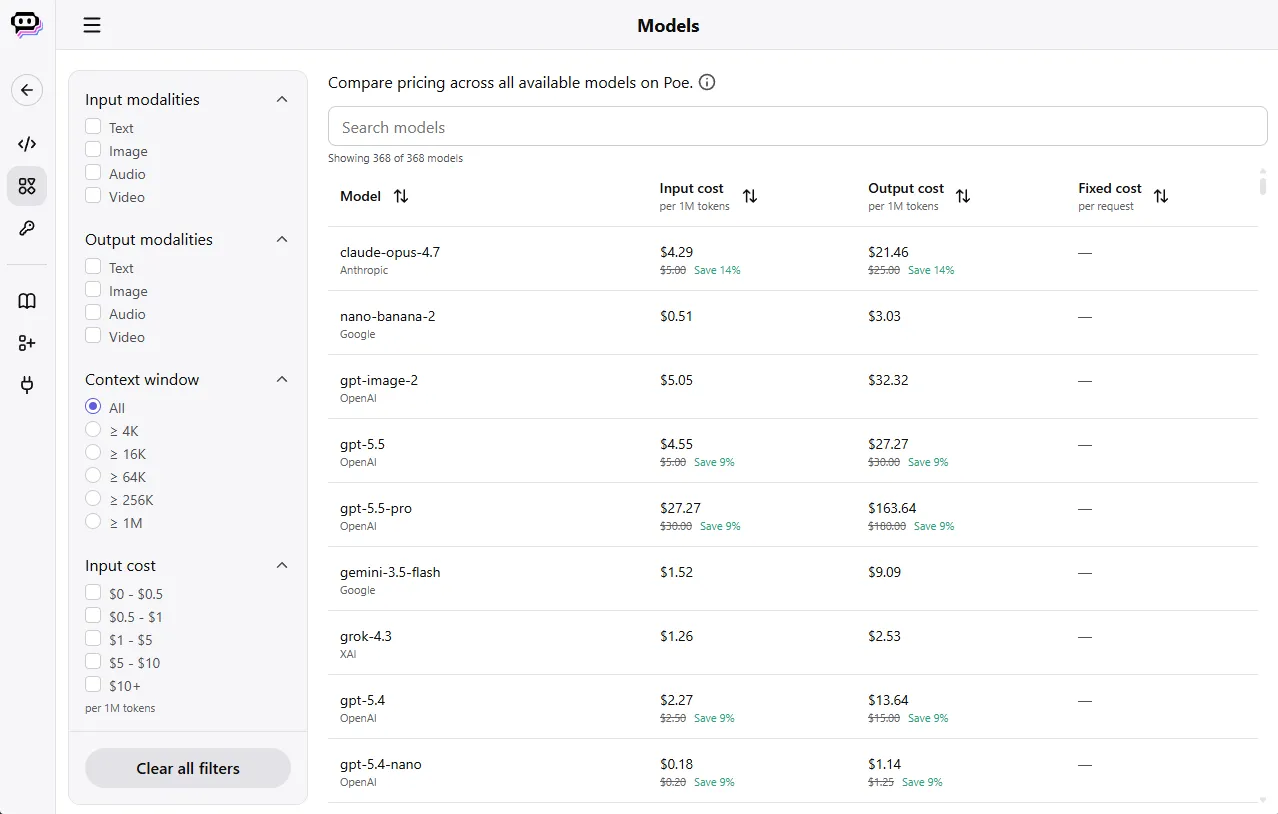
The design and eng gap started to close. Better code quality cut bloat and maintenance overhead, which the whole team felt. The mobile engineering team saw what was happening and asked design to bring the same approach to the native apps.
Pricing the unpriceable
Poe aggregates dozens of models from different providers, each with its own economics. Every provider tokenizes text differently, so the same sentence can break into a different number of tokens depending on which model reads it. Every provider prices those tokens differently too, with separate rates for input and output. Layer in multi-modal support, where some providers charge per image and others by resolution, and a single user message could carry wildly different real costs depending on what model answered it and what it was asked to do.
A simple messages-per-month limit couldn't hold up under that kind of variability. Neither, it turned out, could a flat points system. Not every message is created equal. Context length, request size, and response length all carry different real costs, even within the same model.
The product evolved multiple times, each version closing a gap the last one left.
We moved from message limits to points to adapt to a growing ecosystem, to get ahead of a system that was already breaking. It solved part of the problem, but the initial release didn't yet account for the fact that some messages cost more than others.
We later introduced variable points, separating the cost of a request from the cost of a response. That required new product surfaces to keep the system legible, for example, a message details page that provided a cost breakdown. Users needed to understand what they were actually spending, not just see a number go down.
We invested heavily in UXR on naming and comprehension. Most users have no idea what a token is, and didn't need to. Points became the abstraction that let people use the product without understanding the pricing complexity underneath it.
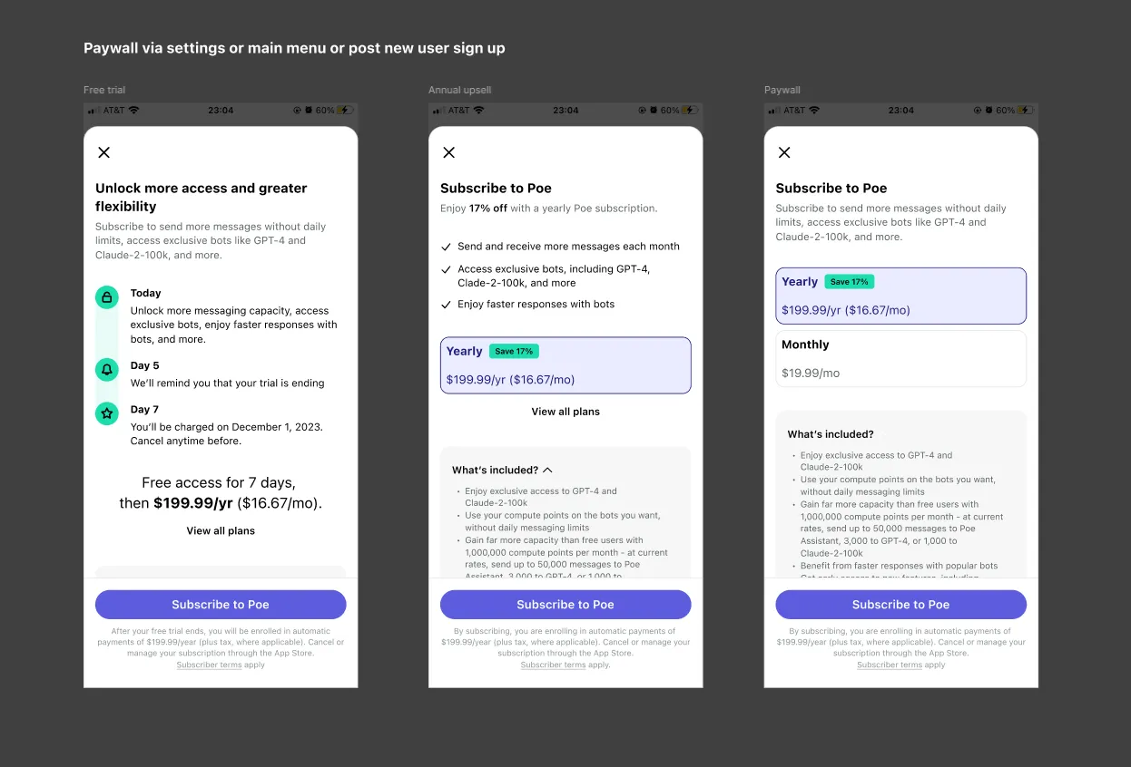
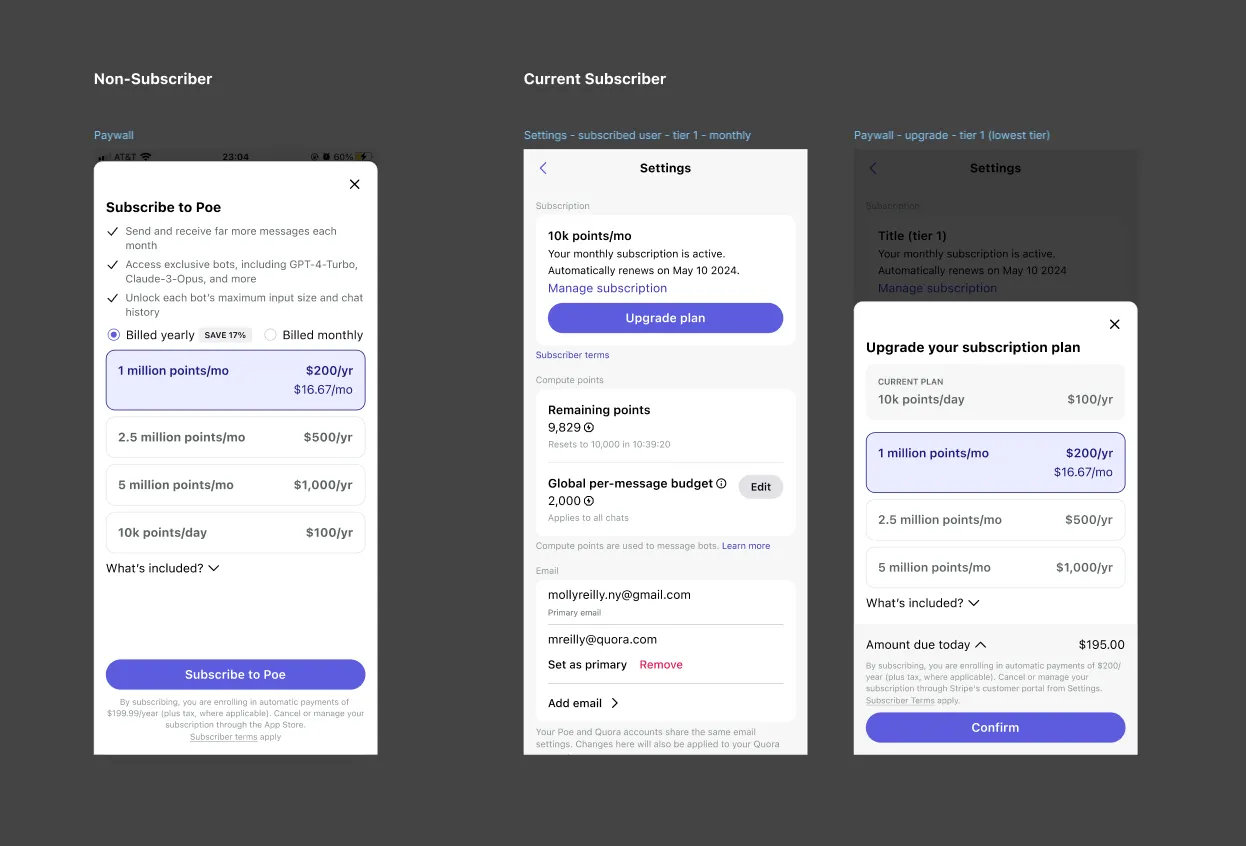
We layered tiered subscriptions on top, calibrated to different usage patterns. This is where the economics get difficult. To make subscriptions competitive, each tier offers more in points value than its price. The $20 tier includes roughly $30 worth of points. That gap is what makes the product worth it beyond simple convenience. It also means every tier is subsidized by design, and the subsidy only works if most users don't spend everything they're given.
For the $20 tier, that holds. Most users use a fraction of their points, and their unused value covers the users who use it all. Higher tiers break that balance. Power users are far more likely to spend everything they're given, cutting into our margins and making these tiers unsustainable unless usage drops off. The tradeoff is deliberate: lower margin, sometimes negative, in exchange for retaining the power users who matter most to the product.
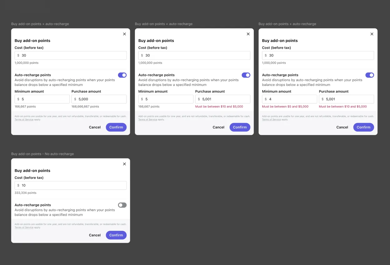
The final piece was introducing add-on points. Power users could now pay for additional usage directly, without that cost being absorbed inside an already-subsidized tier. It gave the product a way to retain its heaviest users without losing money on every one of them, and opened the door to eventually simplifying the pricing model altogether.